While we try not to fall into the trap of chasing the latest trends (instead tuning into the personal style of our clients homes and using colours and styles that transcend the trend cycle) we can’t deny the anticipation and joy in Pantone and the likes ‘colour of the year’ announcements.
Like most things in life, it’s all about balance. Honour the tried and true but look to the fresh and trending for inspiration too (extra points for rhyming)! So we have scoured and analysed the colour forecasts from around the globe to bring you our personal favourites and how you could work them into your next renovation.
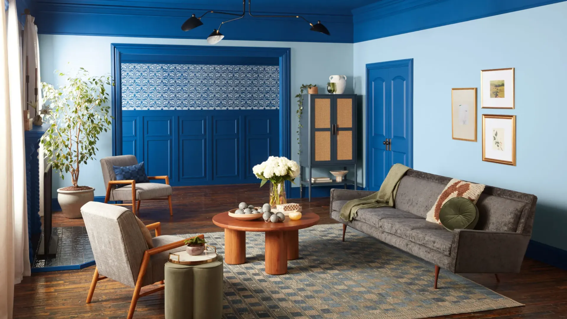
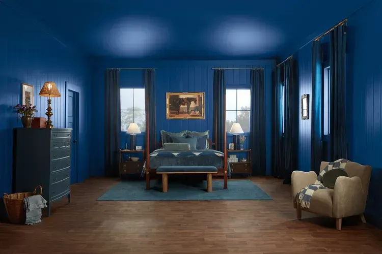
Encore Blue from Valspar
Various hues of blue were popular among the 2024 colour trends and designers agree that they aren’t going anywhere. With last year’s shades leaning cool and calm encore blue is a deep cobalt a perfect pick from the ultramarine family. This shade evokes an unexpected sense of nature pulling from the colours of the night sky and deep sea. This colour feels classic yet modern and will bring vibrancy to any room whether it be on your walls, as a finish for cabinetry or in your soft furnishings.
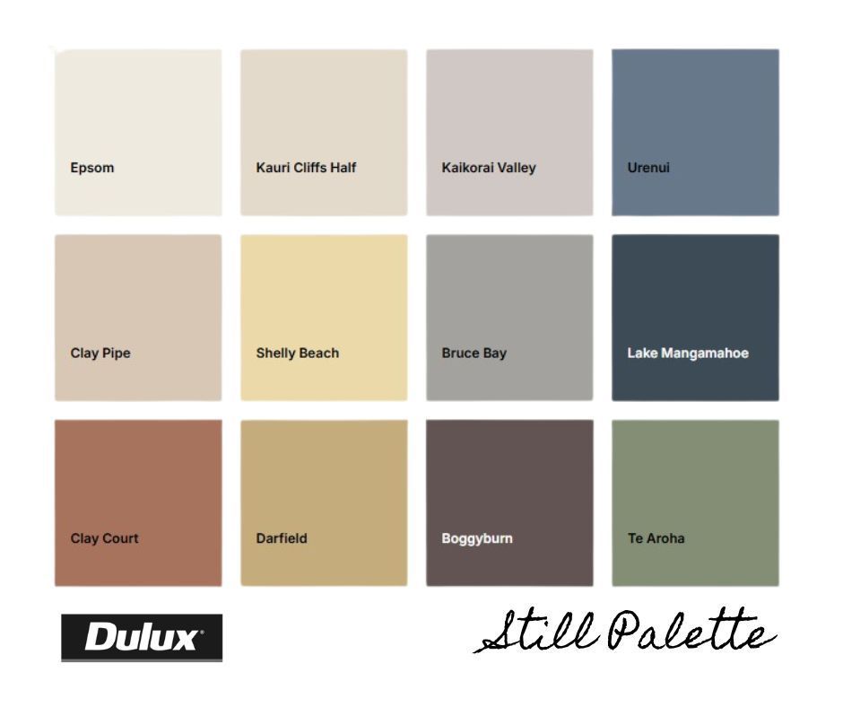
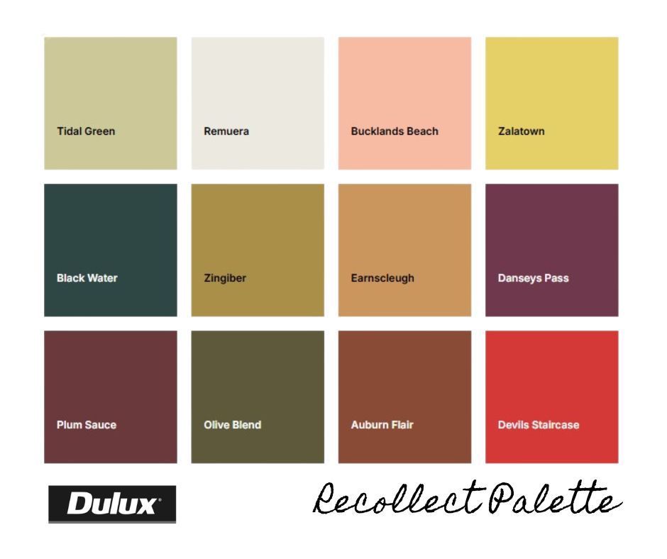
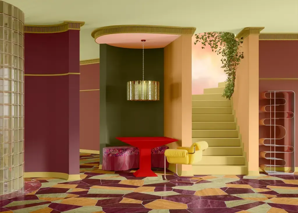
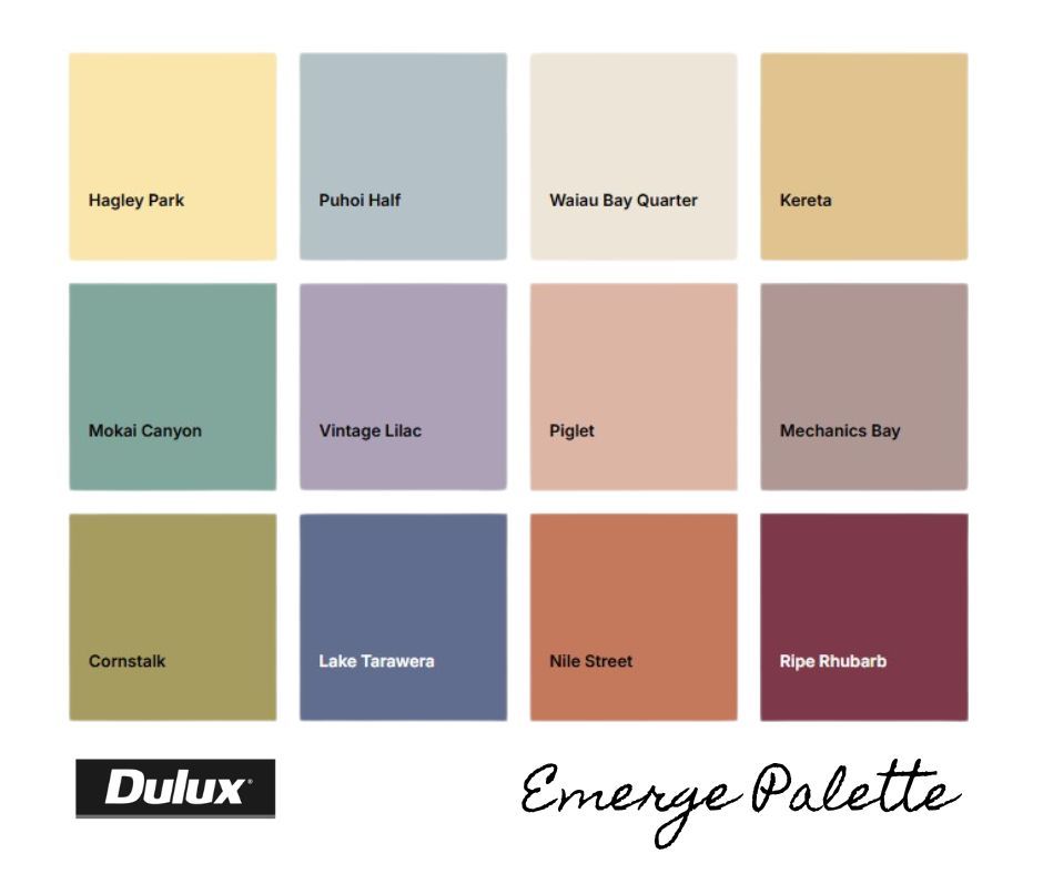
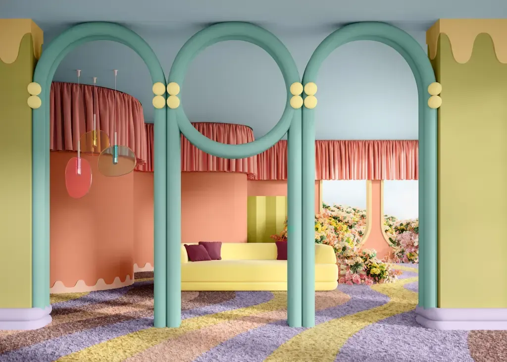
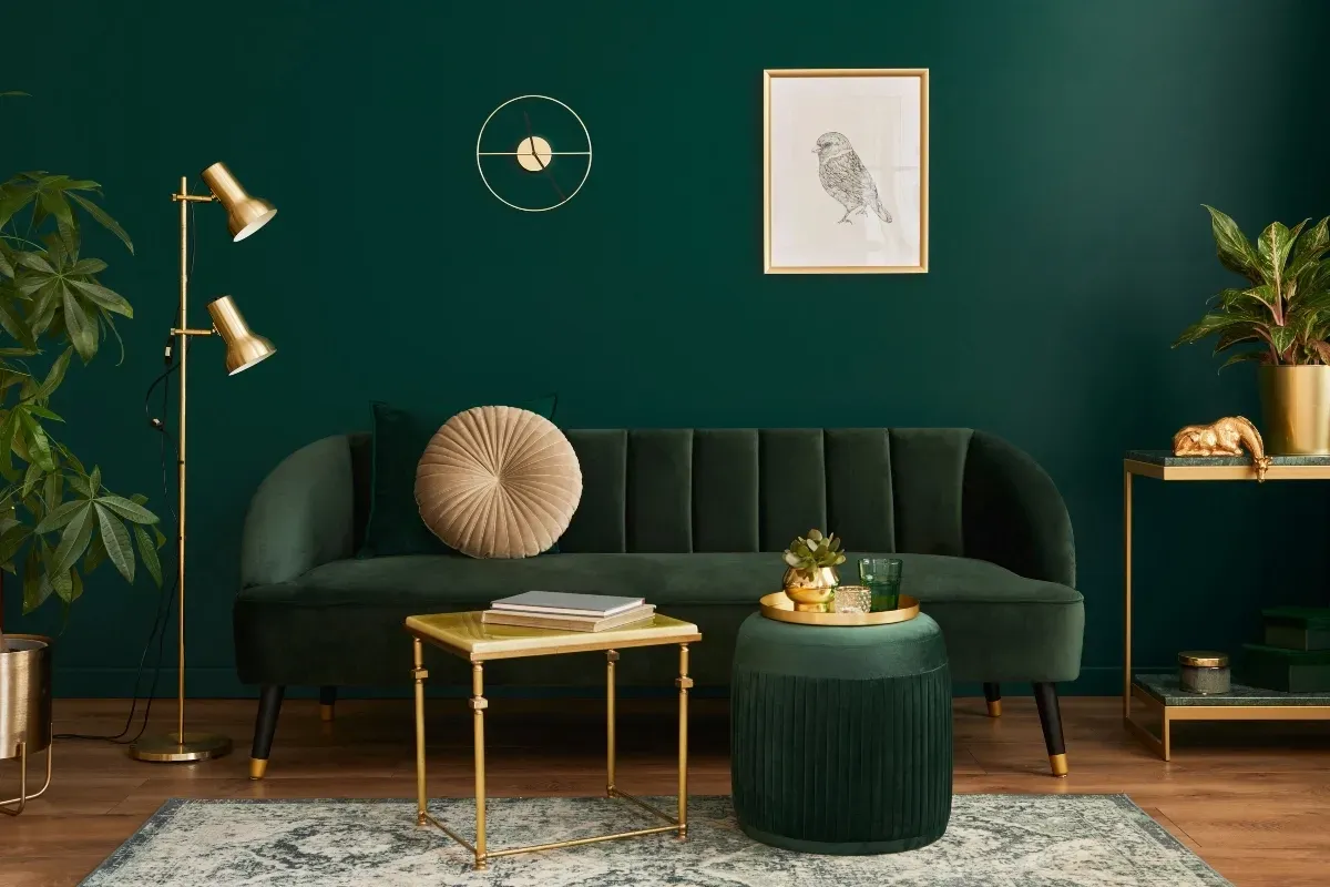
Dulux Emerge, Still & Recollect Palletes
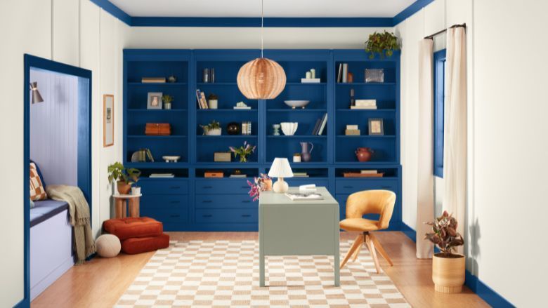
While it must feel special to be the colour of the year Dulux takes a much more practical approach in forecasting 3 trending palletes for 2025; Emerge, Still & Recollect. Each pallete is made up of a foundation of neutral beige, browns and warm whites that are complimented by accents of greens, blues or rich burgundies, the palettes are suited to any architectural style of home.
Dulux predicts contrasting colour schemes will re-emerge for those drawn to an energetic and sophisticated palette. For the neutral palette lovers, warmth and tactility will be a key influence in any finished design.
These palettes all work towards the same goal of creating interiors with a sense of nurture and positivity. Dulux Colour Specialist Davina Harper explains that in times of instability, such as the current cost of living crisis and ongoing overseas conflicts colour can be a powerful antidote to lift spirits and provide a sense of comfort and warmth.
Wine Lovers Rejoice
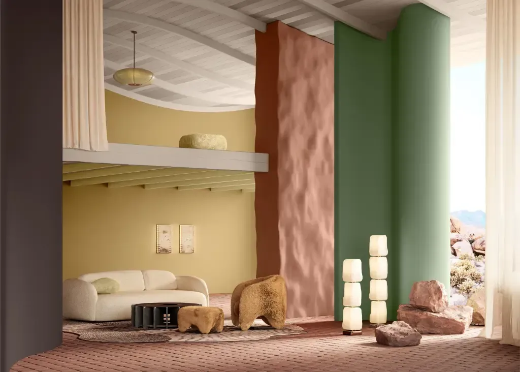
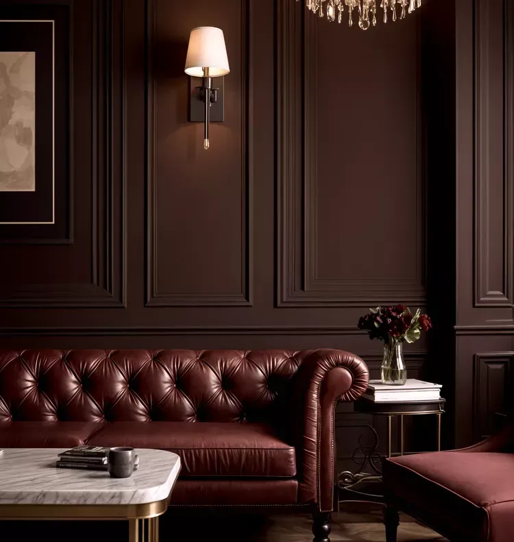
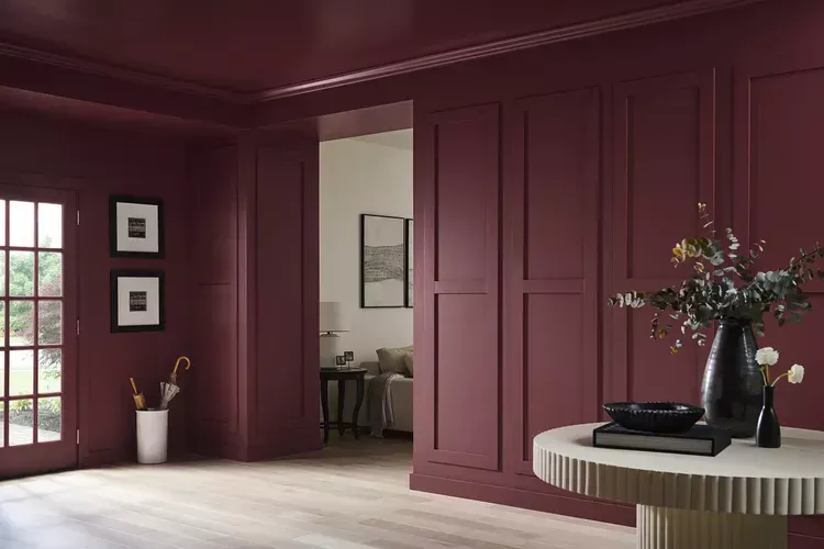
Rich red burgundy hues feature across various colour forecasts; namely Rumours by Behr and Raku by C2 Paint both crowned colour of the year respectively. These earthy and deep colours feel both calming and dramatic and can work well in many home styles. Philippa Radon, C2 Paint’s colour director describes Raku as “An expression of balance, comfort, and timeless elegance. Raku embodies the art of revitalizing the old with the succession of its renewal—an echo of a timeless classic flourishing in a modern world.”
These brownish red shades are evocative of mahogany and similarly are suited to colour drench a more formal space such as a dining room or office and will shine when complimented by traditional features such as ornate gold accents and ornate fabrics. Or for smaller projects where you want just a pop of colour consider your fav burgundy tone for your front door or kitchen cabinets.
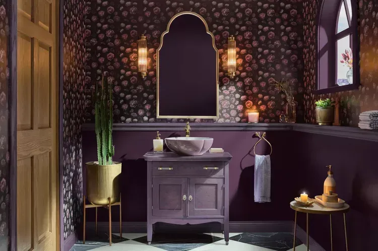
Purple Reigns Supreme
Though not yet announced several forecasters have slated Pantone’s Future Dusk shade as the much-anticipated Pantone Colour of the Year. This trend of deep moody purples is echoed in some other highlighted hues such as Violet by Minwax and Purple Basil by Glidden. Glidden describes this jewel tone as representative of self-discovery and self-expression and the maximalism style so many are tapping into while revamping their homes. This color is equally cozy and warm as it is opulent and rich, making it a perfect paint for those who want to dive into colour but still want a sense of security.
For interior use Inside the shade be used in offices and bathrooms, as well as on kitchen cabinets. Colour-drench an entire space for an eye-catching statement or create contrast with patterned wallpaper. Be sure to get a sample first—depending on the paint’s finish or texture of the surface it’s applied to, the paint can morph into various shades, some leaning more blue and others more red. And of course this is the perfect shade to pair with wood tones – a match made in interior design heaven.
Ready to pull the trigger on your colourful renovation dreams? Get in touch now to book your free in-home consultation with your local Pzazz home renovation specialist. And be sure to talk to them about our 3D Design packages - the perfect way to play and test colours before committing to the real thing.